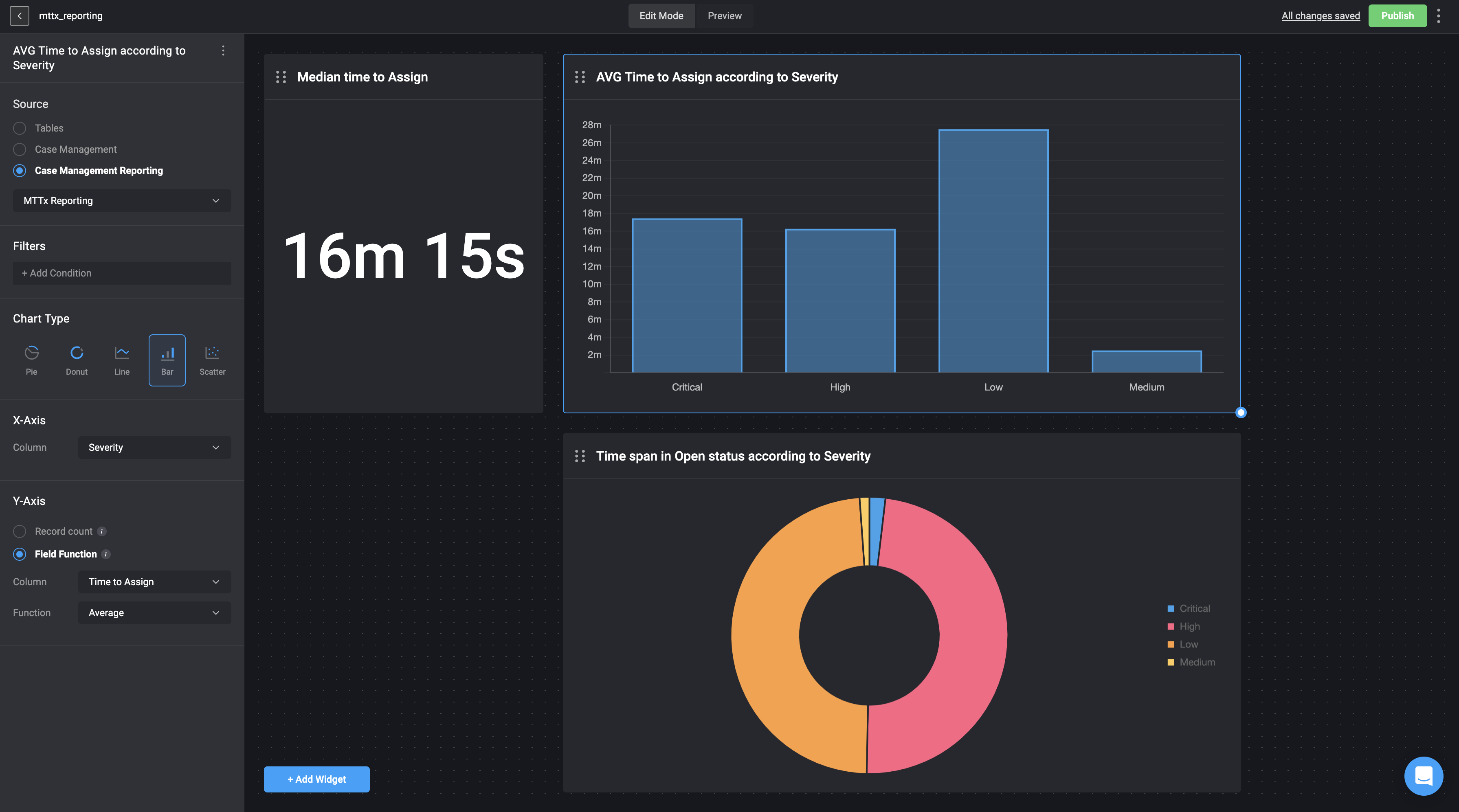
Average Time to Assign a Case Manager to a Case According to Case Severity
The following use case example displays the MTTx data source in the form of a bar chart, collected from the Cases Tables (Case Management Reporting). This chart illustrates the average time taken to assign a case to a Case Manager, grouped by the severity of the cases. The data visualization helps in understanding how the assignment time varies with different severity levels, providing insights for optimizing the case management process.- Adding a Widget: In the Dashboard Building interface, we selected and added the Bar Chart Widget to represent the data.
- Selecting a Data Source: We chose Case Management Reporting as our data source and selected the MTTx (Mean Time To x) data. MTTx represents the time duration between different stages in a case’s process.
-
Configuring the Axes:
- X-axis: Displays the Cases Severity column - critical, high, low and medium.
- Y-axis: We displayed the average time duration it took to assign Case Manager to a case from when the case was first created.