> ## Documentation Index
> Fetch the complete documentation index at: https://docs.blinkops.com/llms.txt
> Use this file to discover all available pages before exploring further.
# Charts
> Instructions on how to create and use the Chart Widget
## Adding Chart Widgets
In the *Edit Mode* tab of the Dashboards Building Interface, click the "add a widget" button.
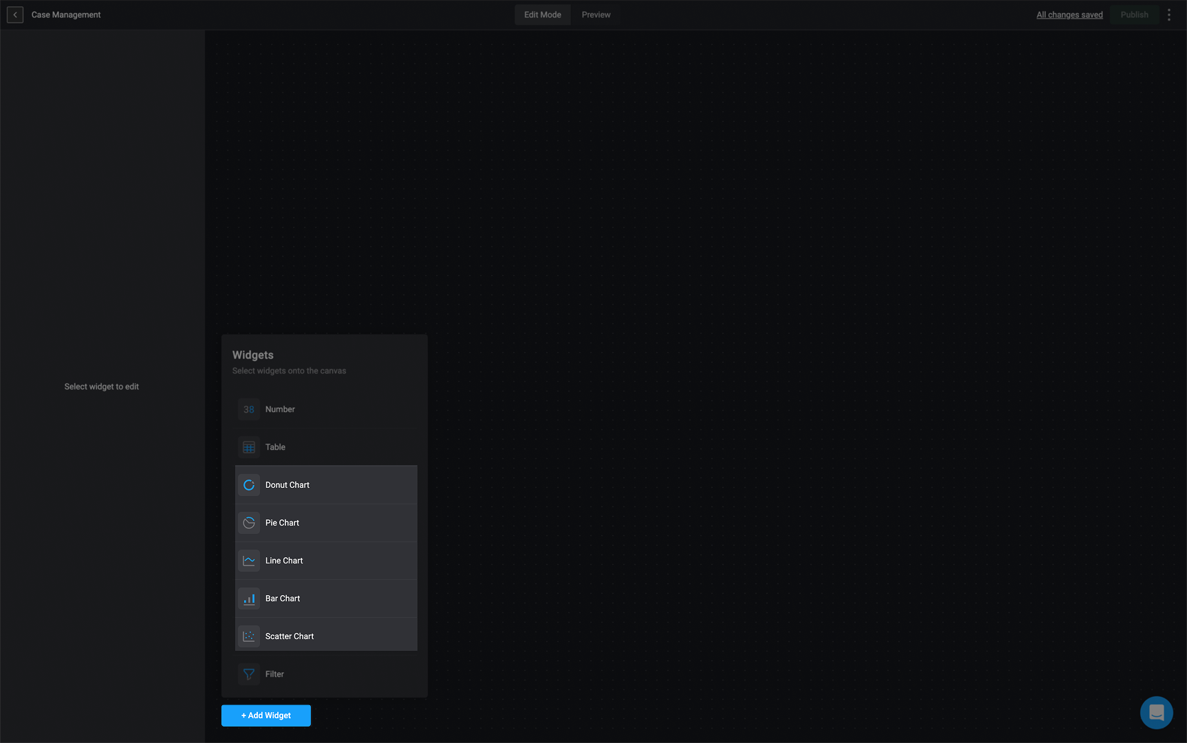
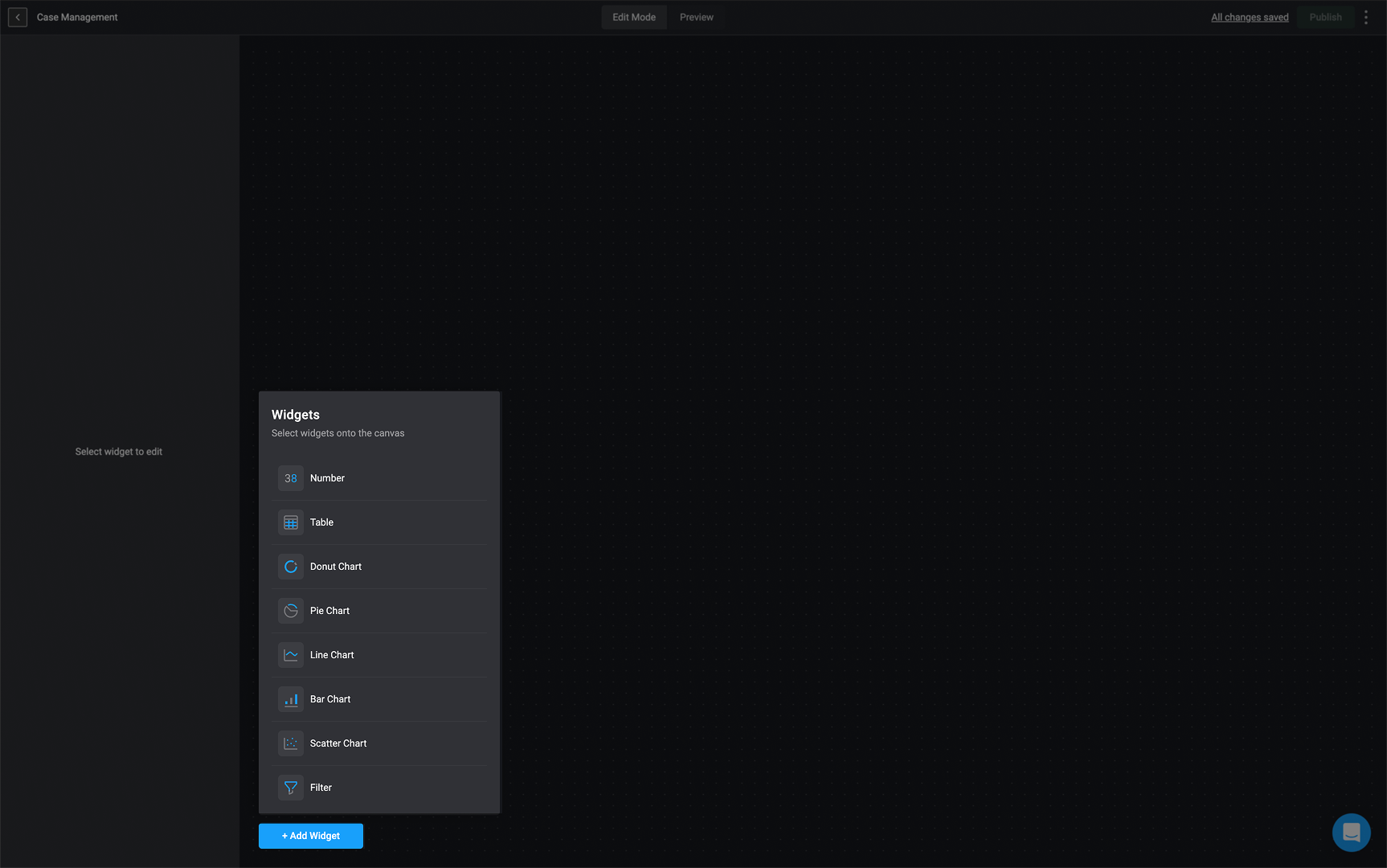 Choose the type of chart you want to utilize. You can choose between a Pie, Donut, Bar, Line or Scatter chart.
 In the top left corner, double-click on *Untitled widget* and provide a name for the selected chart widget.
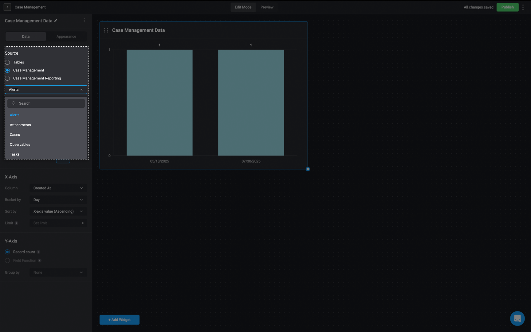
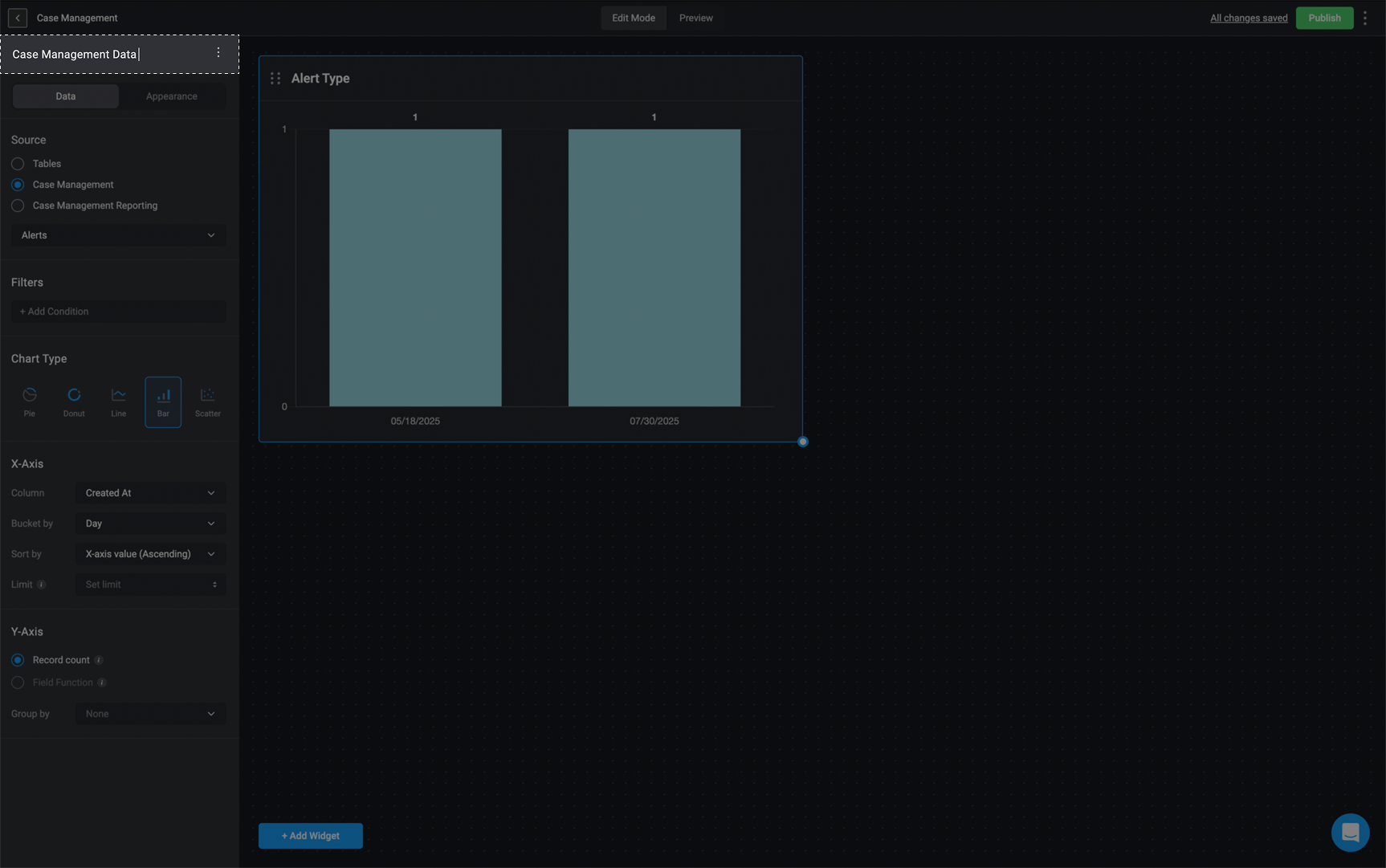 Choose a data source: [Tables](/docs/blink-platform/tables/tables), [Case Management Tables](/docs/case-management/manage-tables) or [Case Management Reportings](/docs/blink-platform/dashboards/building-a-dashboard/source-types/case-management-reporting) and proceed by selecting the specific table column from the data source you would like to use.
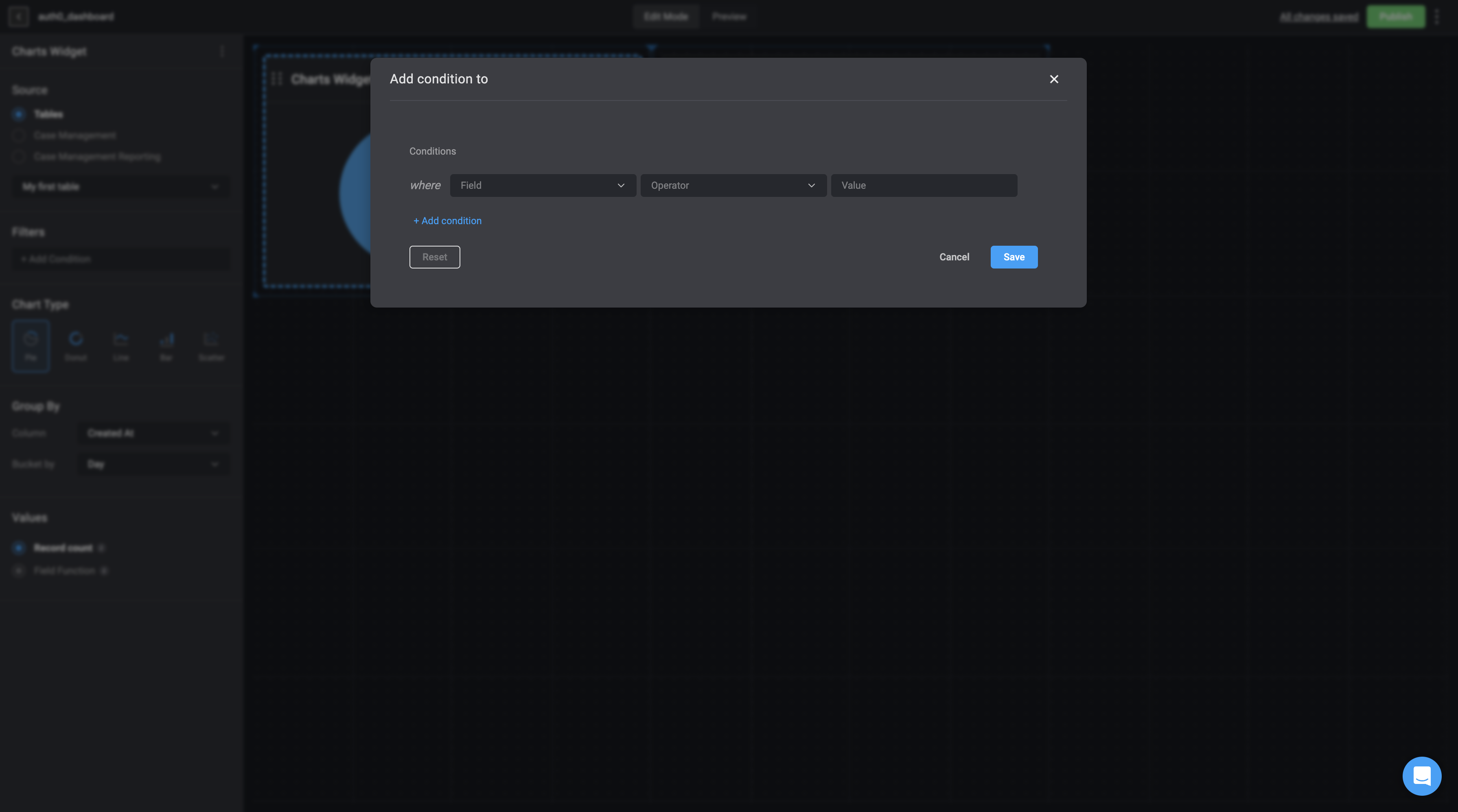
 Under the Filters section, you can use the [condition builder](/docs/workflows/building-workflows/condition-builder#condition-builder) to define one or more conditions that determine which records are included, filtering the underlying data accordingly. You can also create [nested conditions](/docs/blink-platform/condition-builder/condition-builder#the-advanced-condition-builder-and-nested-conditions) to group related conditions together and apply their own `AND` or `OR` logic, enabling more advanced and precise filtering.
 ## Chart Types and Configuration
### Pie Chart Data Configuration
**Note**
The data used to configure the `pie chart` will be taken from a particular table from the [tables feature](/docs/blink-platform/tables/tables) or [case management feature](/docs/case-management/case-management).
As a reminder, chart elements can expose raw data that may be sensitive, and therefore should not be used if you have concerns with viewers being able to see that information.
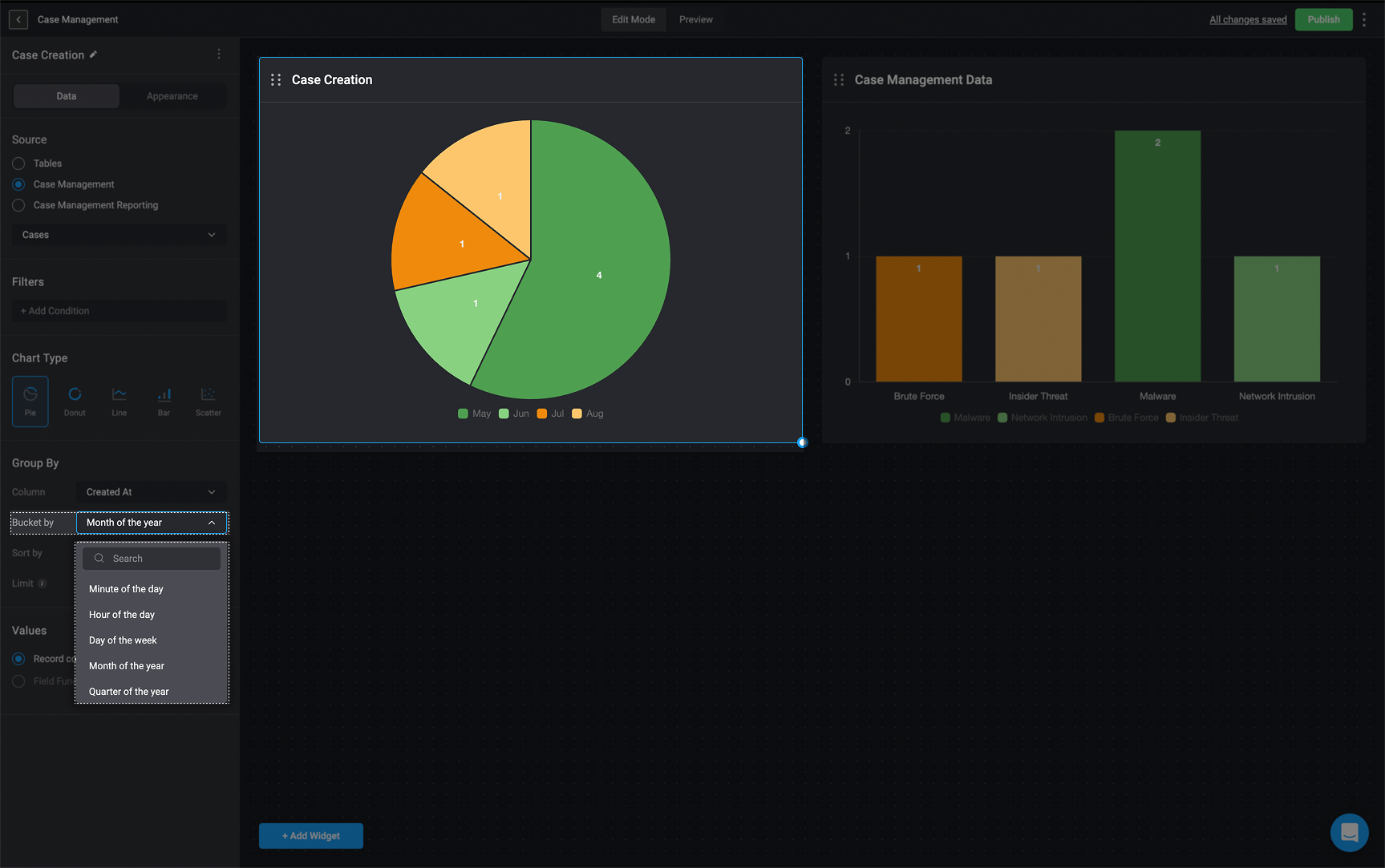
1. **Column**: Choose the table column you want to **group** the `pie chart` by.
* If the selected column is a time period, you will see the **Bucket by** option, allowing you to categorize the time period. This will be shown as a legend on the right side of the `pie chart`.
## Chart Types and Configuration
### Pie Chart Data Configuration
**Note**
The data used to configure the `pie chart` will be taken from a particular table from the [tables feature](/docs/blink-platform/tables/tables) or [case management feature](/docs/case-management/case-management).
As a reminder, chart elements can expose raw data that may be sensitive, and therefore should not be used if you have concerns with viewers being able to see that information.
1. **Column**: Choose the table column you want to **group** the `pie chart` by.
* If the selected column is a time period, you will see the **Bucket by** option, allowing you to categorize the time period. This will be shown as a legend on the right side of the `pie chart`.
 * If the selected column contains user-related data, the 'User Count' option becomes available. This lets you choose how to group and count the data:
* Distinct Count – Counts each user and group separately. If a record is linked to a specific user, that user’s name (or email) will appear in the legend. For example, in a pie chart, each slice represents an individual user or group
* Aggregated View– Groups records by user groups instead of individual entities. The legend will only show group names, and the count will include all records linked to the group, including those assigned to individual users in the group.
### Scenario:
A team is tracking case management tasks using a pie chart where the **"Assigned To"** column contains user-related data. In this example:
There are a total of **5** Tasks
* **Talia** is assigned **1 task**
* **John** is assigned **1 task**.
* **Noah** is assigned **2 tasks**.
* **Group-CM Collab** (which includes both John and Noah) is assigned **1 case**.
* If the selected column contains user-related data, the 'User Count' option becomes available. This lets you choose how to group and count the data:
* Distinct Count – Counts each user and group separately. If a record is linked to a specific user, that user’s name (or email) will appear in the legend. For example, in a pie chart, each slice represents an individual user or group
* Aggregated View– Groups records by user groups instead of individual entities. The legend will only show group names, and the count will include all records linked to the group, including those assigned to individual users in the group.
### Scenario:
A team is tracking case management tasks using a pie chart where the **"Assigned To"** column contains user-related data. In this example:
There are a total of **5** Tasks
* **Talia** is assigned **1 task**
* **John** is assigned **1 task**.
* **Noah** is assigned **2 tasks**.
* **Group-CM Collab** (which includes both John and Noah) is assigned **1 case**.
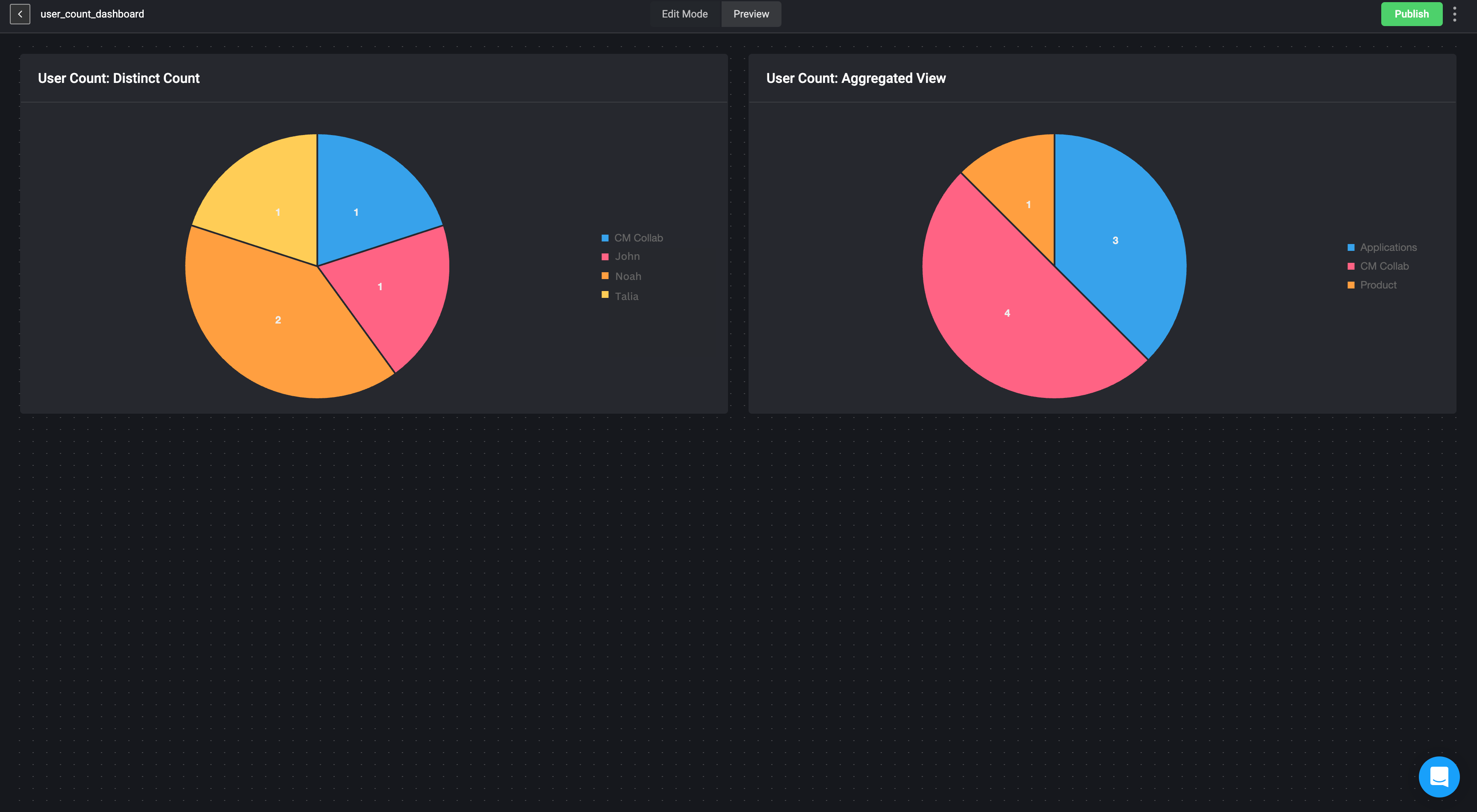 When visualizing this data, two different counting methods can be used:
#### **1. Distinct Count**
In this view, each task assigned to the users and group are counted separately:
* **Talia** is assigned **1 task**
* **John: 1 tasks**
* **Noah: 2 tasks**
* **Group-CM Collab: 1 task** (only counting tasks assigned directly to the group, without including those tasks assigned to its members).
#### **2. Aggregated View**
In this view, tasks are counted at the group level, including tasks belonging to individuals within the group:
* **Group- CM Collab** appears as one of the groups as a legend item.
* **Total tasks counted for Group- CM Collab: 4** (**1 task** assigned to John + **2 tasks** assigned to Noah + **1 task** assigned directly to Group- CM Collab).
2. **Sort By:** Choose the order you want the data sorted by:
* Segment name (ascending)
* Segment name(descending)
* Segment count(ascending)
* Segment count(descending)
When visualizing this data, two different counting methods can be used:
#### **1. Distinct Count**
In this view, each task assigned to the users and group are counted separately:
* **Talia** is assigned **1 task**
* **John: 1 tasks**
* **Noah: 2 tasks**
* **Group-CM Collab: 1 task** (only counting tasks assigned directly to the group, without including those tasks assigned to its members).
#### **2. Aggregated View**
In this view, tasks are counted at the group level, including tasks belonging to individuals within the group:
* **Group- CM Collab** appears as one of the groups as a legend item.
* **Total tasks counted for Group- CM Collab: 4** (**1 task** assigned to John + **2 tasks** assigned to Noah + **1 task** assigned directly to Group- CM Collab).
2. **Sort By:** Choose the order you want the data sorted by:
* Segment name (ascending)
* Segment name(descending)
* Segment count(ascending)
* Segment count(descending)
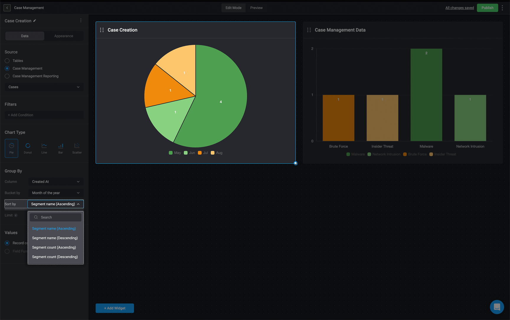 3. **Limit**: Limit the number of bars shown on the chart to hide the lower count values
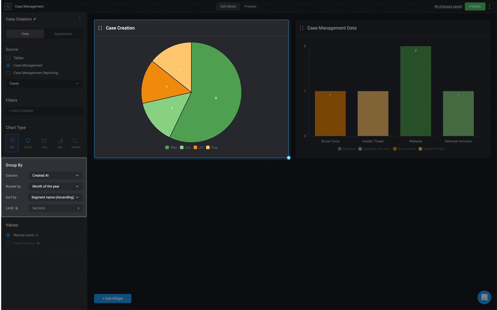 1. If you select **Record Count**:
* The Chart widget will show the total number of records available in the chosen source table.
**OR**
2. If you select **Field Function** (You can only add a **Field Function** if the selected column is a **numeric value**).
* **Choose a column**: `Time from Status Open to Status`, `Time in Status` or `Time to Assign`
* **Choose the sum operation that will be used to calculate the selected column values**: `Sum`, `Maximum`, `Minimum`, `Average` or `Median`.
1. If you select **Record Count**:
* The Chart widget will show the total number of records available in the chosen source table.
**OR**
2. If you select **Field Function** (You can only add a **Field Function** if the selected column is a **numeric value**).
* **Choose a column**: `Time from Status Open to Status`, `Time in Status` or `Time to Assign`
* **Choose the sum operation that will be used to calculate the selected column values**: `Sum`, `Maximum`, `Minimum`, `Average` or `Median`.
 ### Donut Chart Data Configuration
**Note**
The data used to configure the `Donut Chart` will be taken from a particular table from the [tables feature](/docs/blink-platform/tables/tables) or [case management feature](/docs/case-management/case-management).
As a reminder, chart elements can expose raw data that may be sensitive, and therefore should not be used if you have concerns with viewers being able to see that information.
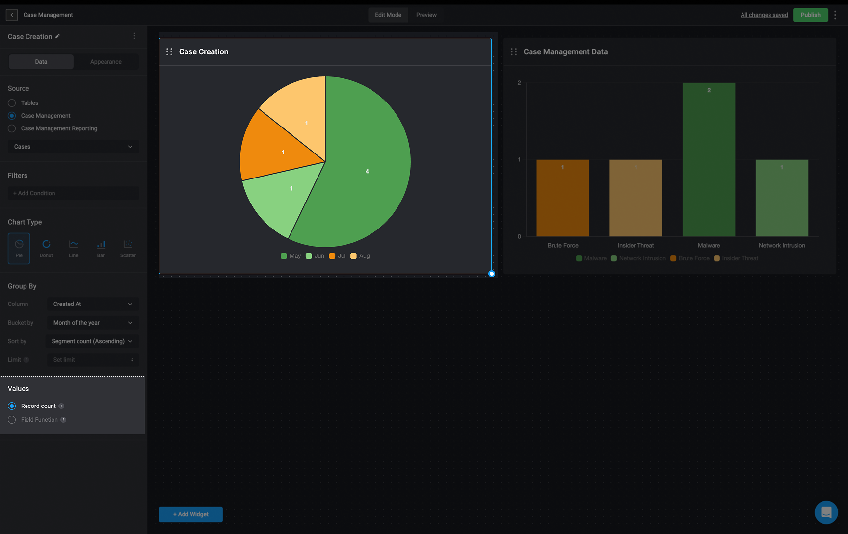
1. **Column**: Choose the table column you want to **group** the `donut chart` by.
* If the selected column is a time period, you will be provided with the **Bucket by** option, allowing you to group the column according the time period. This will be displayed as a legend on the right side of the `donut chart`.
### Donut Chart Data Configuration
**Note**
The data used to configure the `Donut Chart` will be taken from a particular table from the [tables feature](/docs/blink-platform/tables/tables) or [case management feature](/docs/case-management/case-management).
As a reminder, chart elements can expose raw data that may be sensitive, and therefore should not be used if you have concerns with viewers being able to see that information.
1. **Column**: Choose the table column you want to **group** the `donut chart` by.
* If the selected column is a time period, you will be provided with the **Bucket by** option, allowing you to group the column according the time period. This will be displayed as a legend on the right side of the `donut chart`.
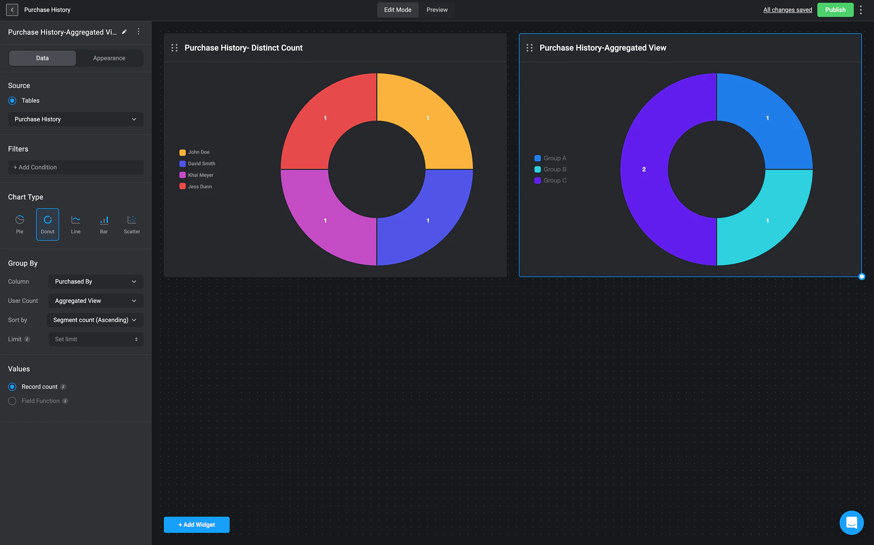
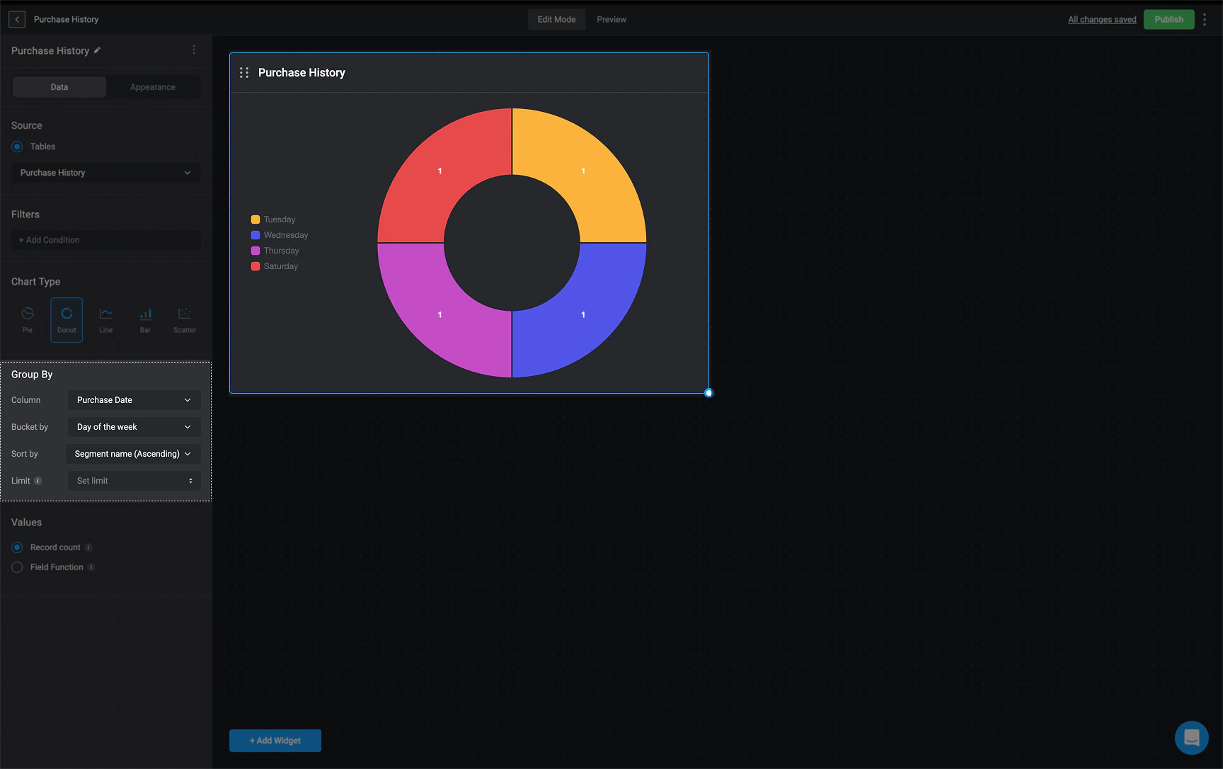 * If the selected column contains user-related data (such as "Purchased By" in this example), the "User Count" option becomes available. This lets you choose how to group and count the data:
* Distinct Count – Counts each user and group separately. If a record is linked to a specific user, that user’s name (or email) will appear in the legend. For example, in a donut chart, each slice represents an individual user or group.
* Aggregated View – Groups records by user groups instead of individual entities. The legend will only show group names, and the count will include all records linked to the group, including those assigned to specific users within it.
* If the selected column contains user-related data (such as "Purchased By" in this example), the "User Count" option becomes available. This lets you choose how to group and count the data:
* Distinct Count – Counts each user and group separately. If a record is linked to a specific user, that user’s name (or email) will appear in the legend. For example, in a donut chart, each slice represents an individual user or group.
* Aggregated View – Groups records by user groups instead of individual entities. The legend will only show group names, and the count will include all records linked to the group, including those assigned to specific users within it.
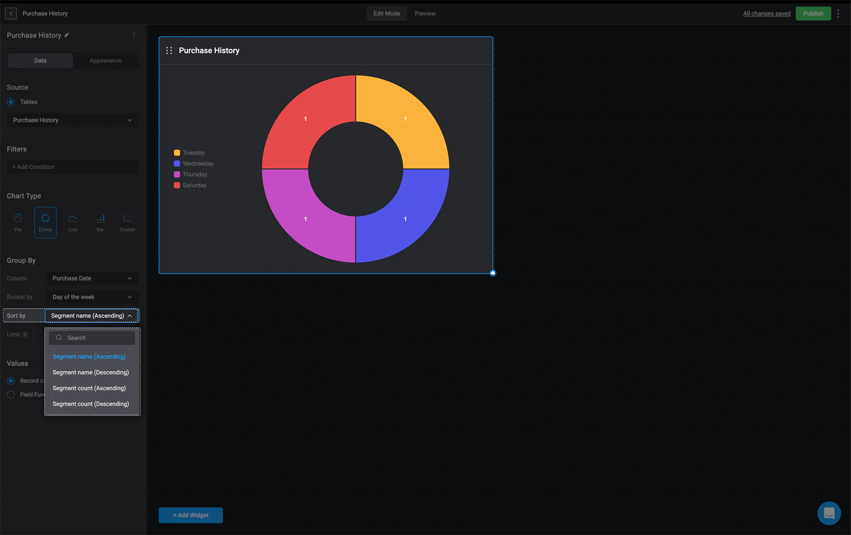
 2. **Sort By:** Choose the order you want the data sorted by:
* Segment name (ascending)
* Segment name(descending)
* Segment count(ascending)
* Segment count(descending)
2. **Sort By:** Choose the order you want the data sorted by:
* Segment name (ascending)
* Segment name(descending)
* Segment count(ascending)
* Segment count(descending)
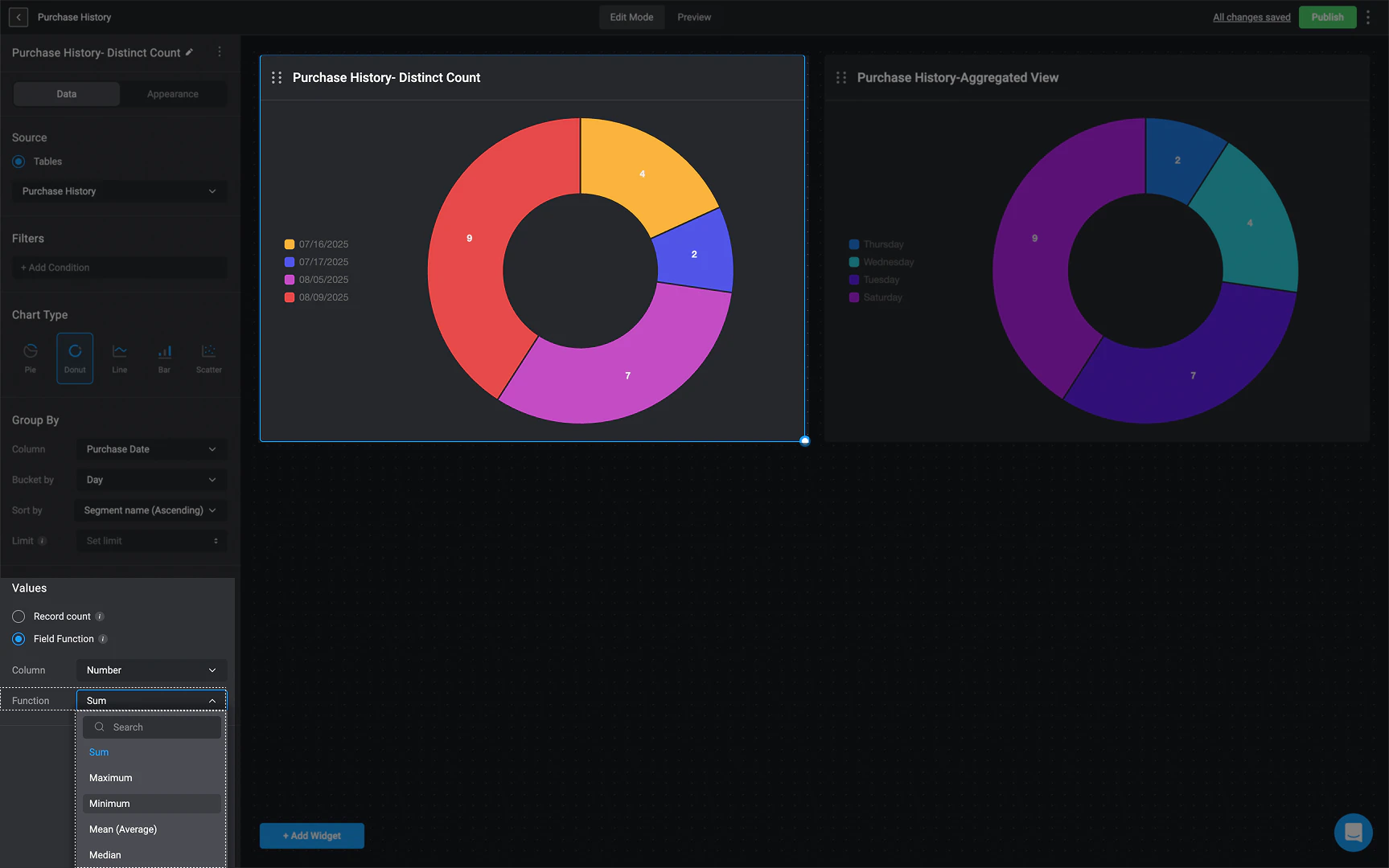
 3. **Limit**: Limit the number of segments shown on the donut chart to hide the lower count values.
1. If you select **Record Count**:
* The Chart widget will show the total number of records available in the chosen source table.
**OR**
2. If you select **Field Function** (You can only add a **Field Function** if the selected column is a **numeric value**).
* **Choose a column**: `Number`
* **Choose the sum operation that will be used to calculate the selected column values**: `Sum`, `Maximum`, `Minimum`, `Average` or `Median`.
3. **Limit**: Limit the number of segments shown on the donut chart to hide the lower count values.
1. If you select **Record Count**:
* The Chart widget will show the total number of records available in the chosen source table.
**OR**
2. If you select **Field Function** (You can only add a **Field Function** if the selected column is a **numeric value**).
* **Choose a column**: `Number`
* **Choose the sum operation that will be used to calculate the selected column values**: `Sum`, `Maximum`, `Minimum`, `Average` or `Median`.
 ### Bar Chart Data Configuration
**Note**
The data used to configure the `Bar Chart` will be taken from a particular table from the [tables feature](/docs/blink-platform/tables/tables) or [case management feature](/docs/case-management/case-management).
As a reminder, chart elements can expose raw data that may be sensitive, and therefore should not be used if you have concerns with viewers being able to see that information.
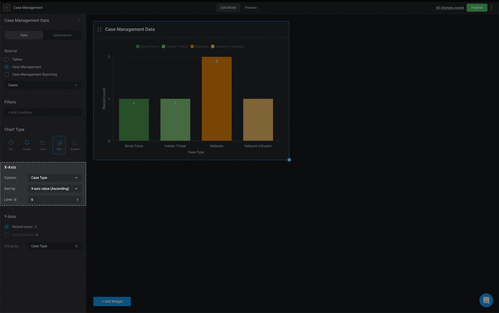
1. **Column**: Choose the table column you want displayed on the **X axis**.
* If the selected column is a **time period**, you will be provided with the **Bucket by** option, allowing you to group the column according the time period.
* If the selected column contains user-related data, the User Count option becomes available. This determines how data is grouped on the x-axis in a bar chart:
* **Distinct Count** – Each bar represents an individual user or group separately. If a record is linked to a specific user, that user’s name (or email) will appear on the x-axis. This allows you to see how many records belong to each user or group independently.
* **Aggregated View** – Groups records by user groups instead of individual entities. The x-axis will display only group names, and the count will include all records assigned to the group, including those assigned to individual users in the group.
2. **Sort By:** Choose how you want the data sorted by:
* X-axis value (ascending)
* X-axis value(descending)
* Y-axis value(ascending)
* Y-axis value(descending)
3. **Limit**: Limit the number of bars shown on the chart to hide the lower count values
### Bar Chart Data Configuration
**Note**
The data used to configure the `Bar Chart` will be taken from a particular table from the [tables feature](/docs/blink-platform/tables/tables) or [case management feature](/docs/case-management/case-management).
As a reminder, chart elements can expose raw data that may be sensitive, and therefore should not be used if you have concerns with viewers being able to see that information.
1. **Column**: Choose the table column you want displayed on the **X axis**.
* If the selected column is a **time period**, you will be provided with the **Bucket by** option, allowing you to group the column according the time period.
* If the selected column contains user-related data, the User Count option becomes available. This determines how data is grouped on the x-axis in a bar chart:
* **Distinct Count** – Each bar represents an individual user or group separately. If a record is linked to a specific user, that user’s name (or email) will appear on the x-axis. This allows you to see how many records belong to each user or group independently.
* **Aggregated View** – Groups records by user groups instead of individual entities. The x-axis will display only group names, and the count will include all records assigned to the group, including those assigned to individual users in the group.
2. **Sort By:** Choose how you want the data sorted by:
* X-axis value (ascending)
* X-axis value(descending)
* Y-axis value(ascending)
* Y-axis value(descending)
3. **Limit**: Limit the number of bars shown on the chart to hide the lower count values
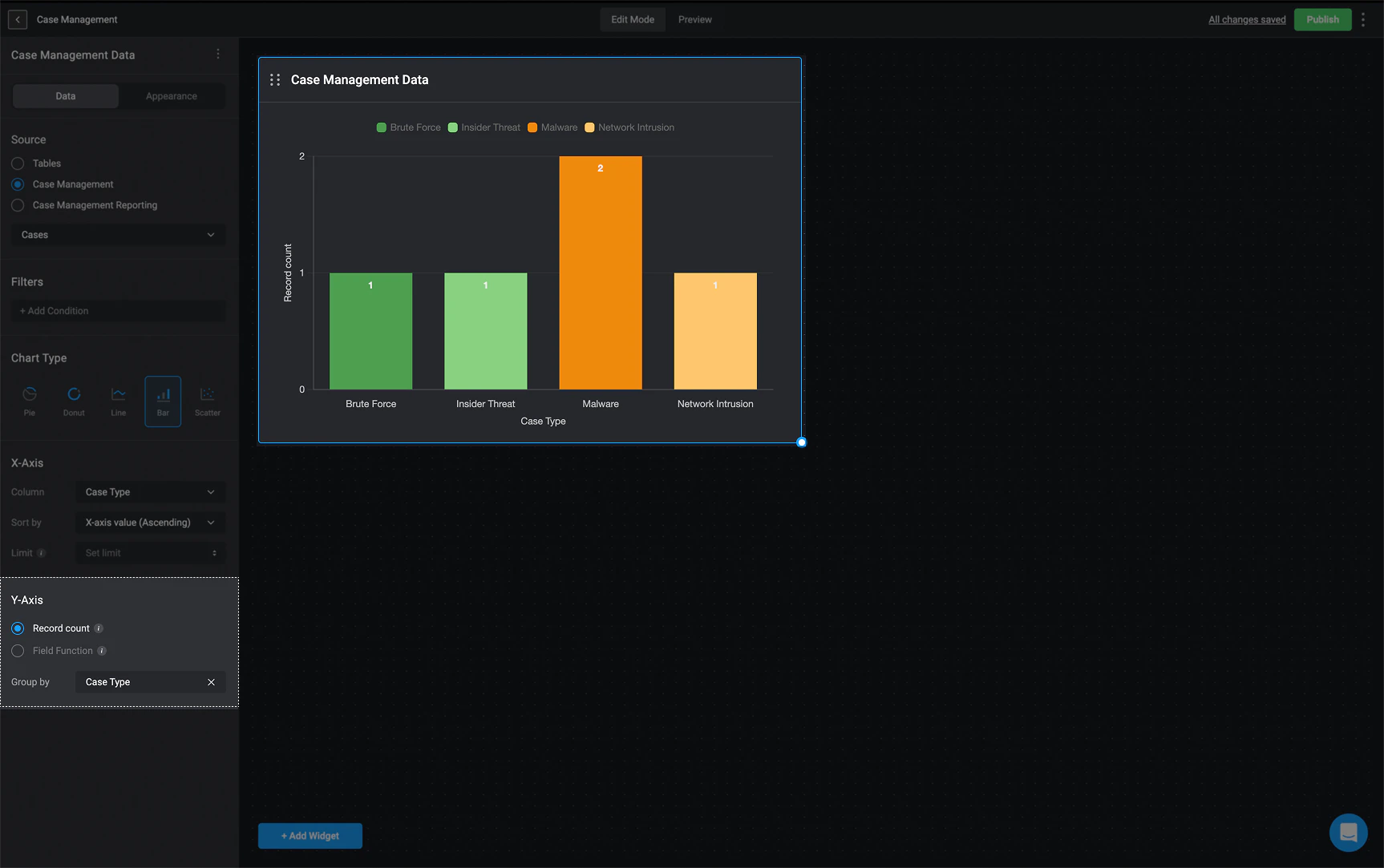
 1. If you select **Record Count**:
* It will display the number of records available on the selected source table on the Chart widget.
1. If you select **Record Count**:
* It will display the number of records available on the selected source table on the Chart widget.
 **OR**
2. If you select **Field Function** (You can only add a **Field Function** if the selected column is a **numeric value**).
* **Choose a column**: `Time from Status Open to Status`, `Time in Status` or `Time to Assign`
* **Choose the sum operation that will be used to calculate the selected column values**: `Sum`, `Maximum`, `Minimum`, `Average` or `Median`.
### Line Chart Data Configuration
**Note**
The data used to configure the `Line Chart` will be taken from a particular table from the [tables feature](/docs/blink-platform/tables/tables) or [case management feature](/docs/case-management/case-management).
As a reminder, chart elements can expose raw data that may be sensitive, and therefore should not be used if you have concerns with viewers being able to see that information.
1. **Column** Choose the table column you want displayed on the **X axis**.
* If the selected column is a time period, you will be provided with the **Bucket by** option, allowing you to group the column according the time period.
**OR**
2. If you select **Field Function** (You can only add a **Field Function** if the selected column is a **numeric value**).
* **Choose a column**: `Time from Status Open to Status`, `Time in Status` or `Time to Assign`
* **Choose the sum operation that will be used to calculate the selected column values**: `Sum`, `Maximum`, `Minimum`, `Average` or `Median`.
### Line Chart Data Configuration
**Note**
The data used to configure the `Line Chart` will be taken from a particular table from the [tables feature](/docs/blink-platform/tables/tables) or [case management feature](/docs/case-management/case-management).
As a reminder, chart elements can expose raw data that may be sensitive, and therefore should not be used if you have concerns with viewers being able to see that information.
1. **Column** Choose the table column you want displayed on the **X axis**.
* If the selected column is a time period, you will be provided with the **Bucket by** option, allowing you to group the column according the time period.
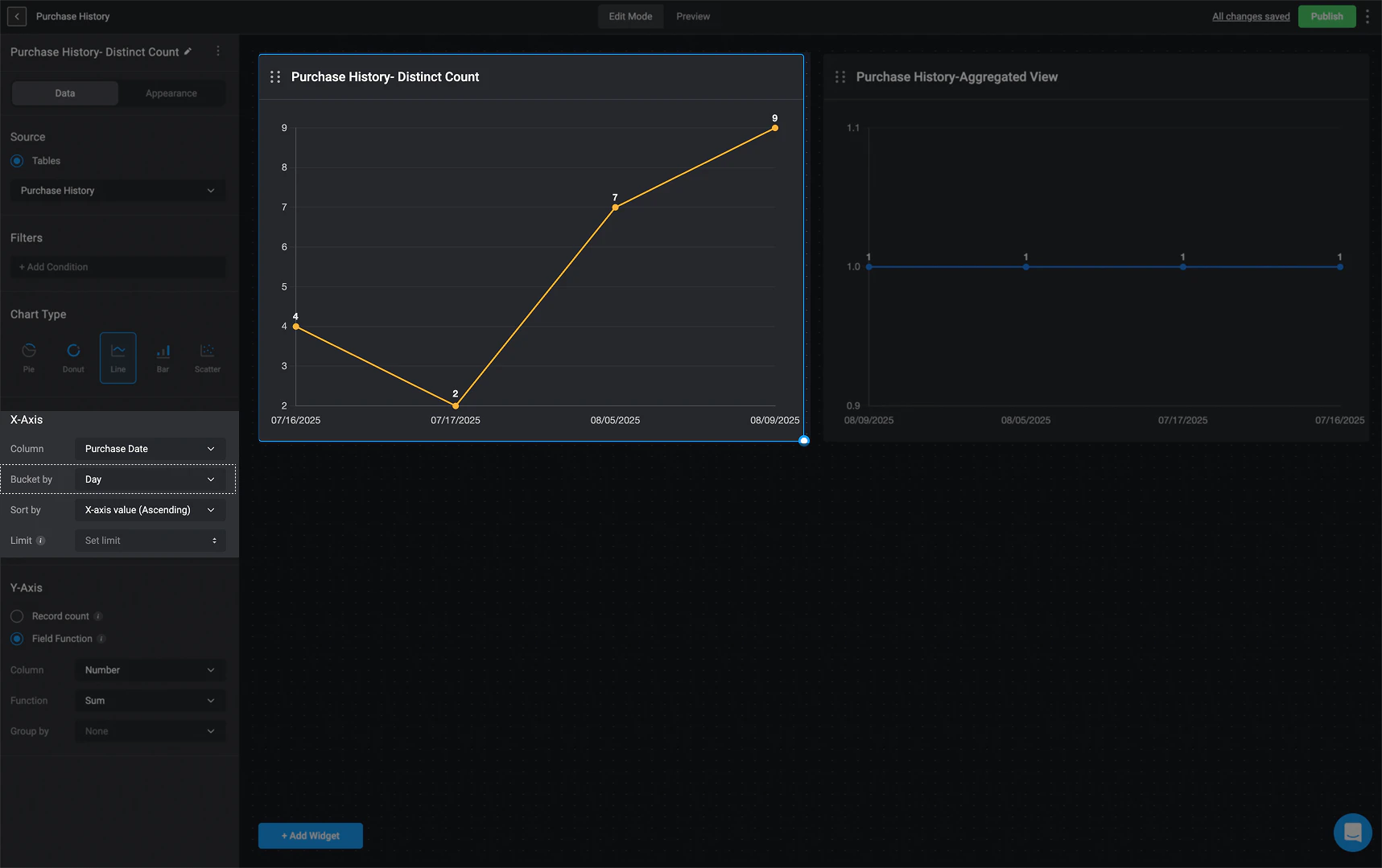 * If the selected column contains user-related data (such as "Purchased By" in this example), the User Count option becomes available. This determines how data is plotted on the x-axis in a line chart:
* **Distinct Count** – Each point on the line represents an individual user or group separately. If a record is linked to a specific user, that user’s name (or email) will appear on the `x-axis`.
* **Aggregated View** – Groups records by user groups instead of individual entities. The `x-axis` will display only group names, and the line will represent the total count of records assigned to each group, including those assigned to individual users in the group.
* If the selected column contains user-related data (such as "Purchased By" in this example), the User Count option becomes available. This determines how data is plotted on the x-axis in a line chart:
* **Distinct Count** – Each point on the line represents an individual user or group separately. If a record is linked to a specific user, that user’s name (or email) will appear on the `x-axis`.
* **Aggregated View** – Groups records by user groups instead of individual entities. The `x-axis` will display only group names, and the line will represent the total count of records assigned to each group, including those assigned to individual users in the group.
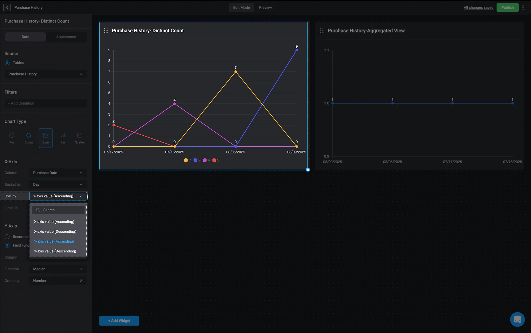
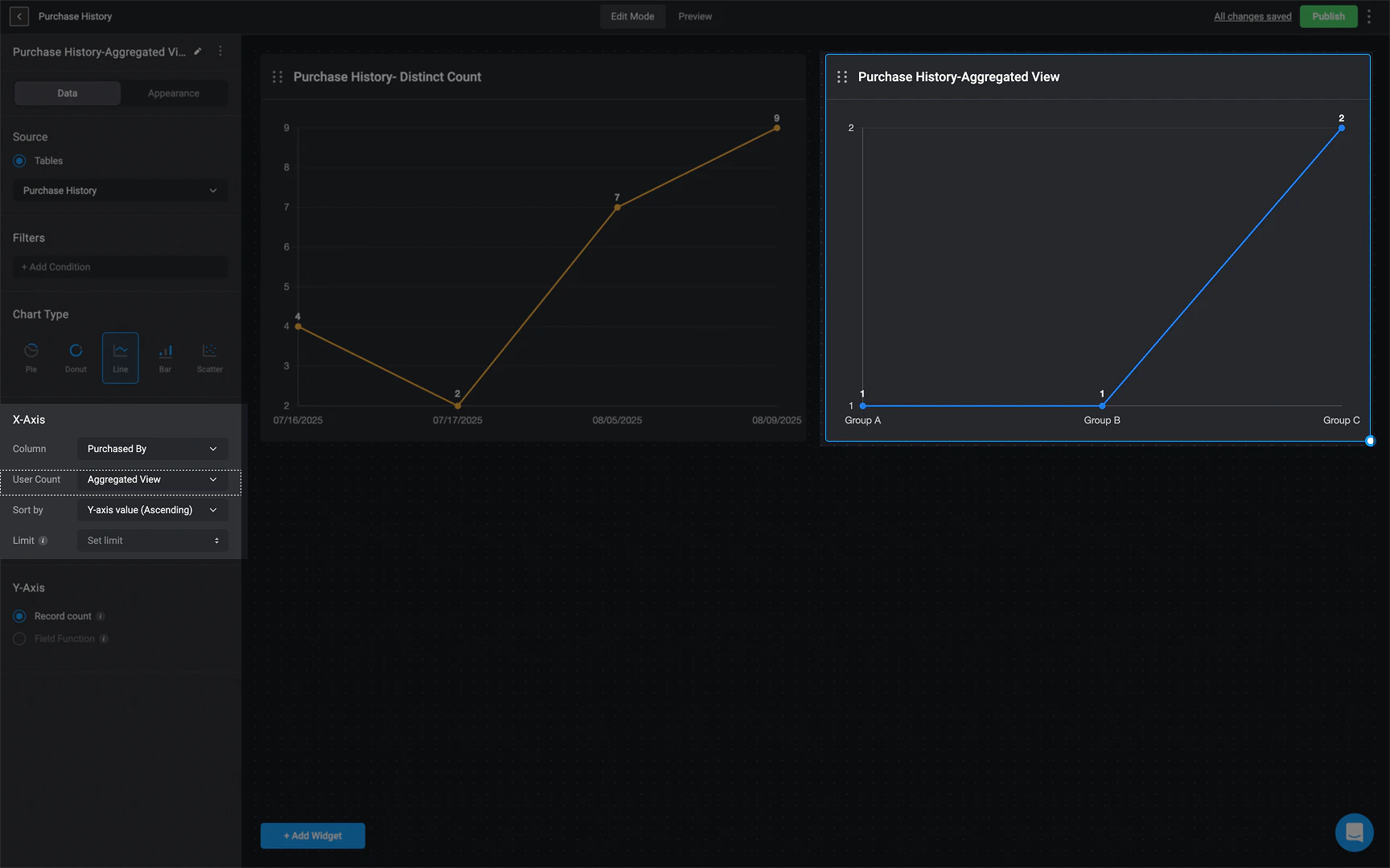 2. **Sort By:** Choose how you want the data sorted by:
* X-axis value (ascending)
* X-axis value(descending)
* Y-axis value(ascending)
* Y-axis value(descending)
2. **Sort By:** Choose how you want the data sorted by:
* X-axis value (ascending)
* X-axis value(descending)
* Y-axis value(ascending)
* Y-axis value(descending)
 3. **Limit**: Limit the number of bars shown on the chart to hide the lower count values
1. If you select **Record Count**:
* The Chart widget will show the total number of records available in the chosen source table.
**OR**
2. If you select **Field Function** (You can only add a **Field Function** if the selected column is a **numeric value**).
* **Choose a column**: `Number`.
* **Choose the sum operation that will be used to calculate the selected column values**: `Sum`, `Maximum`, `Minimum`, `Average` or `Median`.
3. **Limit**: Limit the number of bars shown on the chart to hide the lower count values
1. If you select **Record Count**:
* The Chart widget will show the total number of records available in the chosen source table.
**OR**
2. If you select **Field Function** (You can only add a **Field Function** if the selected column is a **numeric value**).
* **Choose a column**: `Number`.
* **Choose the sum operation that will be used to calculate the selected column values**: `Sum`, `Maximum`, `Minimum`, `Average` or `Median`.
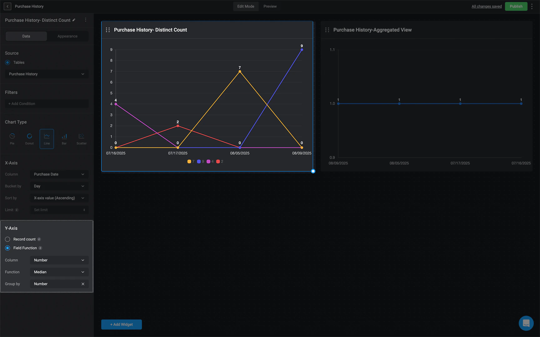 ### Scatter Chart Data Configuration
**Note**
The data used to configure the `Scatter Chart` will be taken from a particular table from the [tables feature](/docs/blink-platform/tables/tables) or [case management feature](/docs/case-management/case-management).
As a reminder, chart elements can expose raw data that may be sensitive, and therefore should not be used if you have concerns with viewers being able to see that information.
1. **Column**: Choose the table column you want displayed on the **X axis**. If the selected column is a time period, you will be provided with the **Bucket by** option, allowing you to group the column according the time period.
### Scatter Chart Data Configuration
**Note**
The data used to configure the `Scatter Chart` will be taken from a particular table from the [tables feature](/docs/blink-platform/tables/tables) or [case management feature](/docs/case-management/case-management).
As a reminder, chart elements can expose raw data that may be sensitive, and therefore should not be used if you have concerns with viewers being able to see that information.
1. **Column**: Choose the table column you want displayed on the **X axis**. If the selected column is a time period, you will be provided with the **Bucket by** option, allowing you to group the column according the time period.
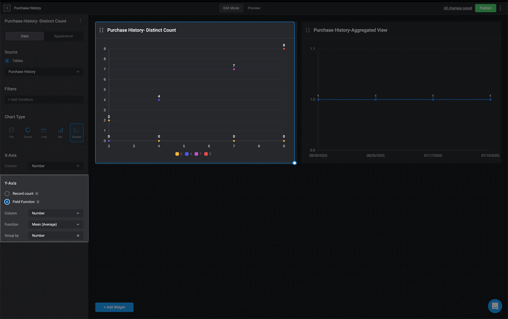
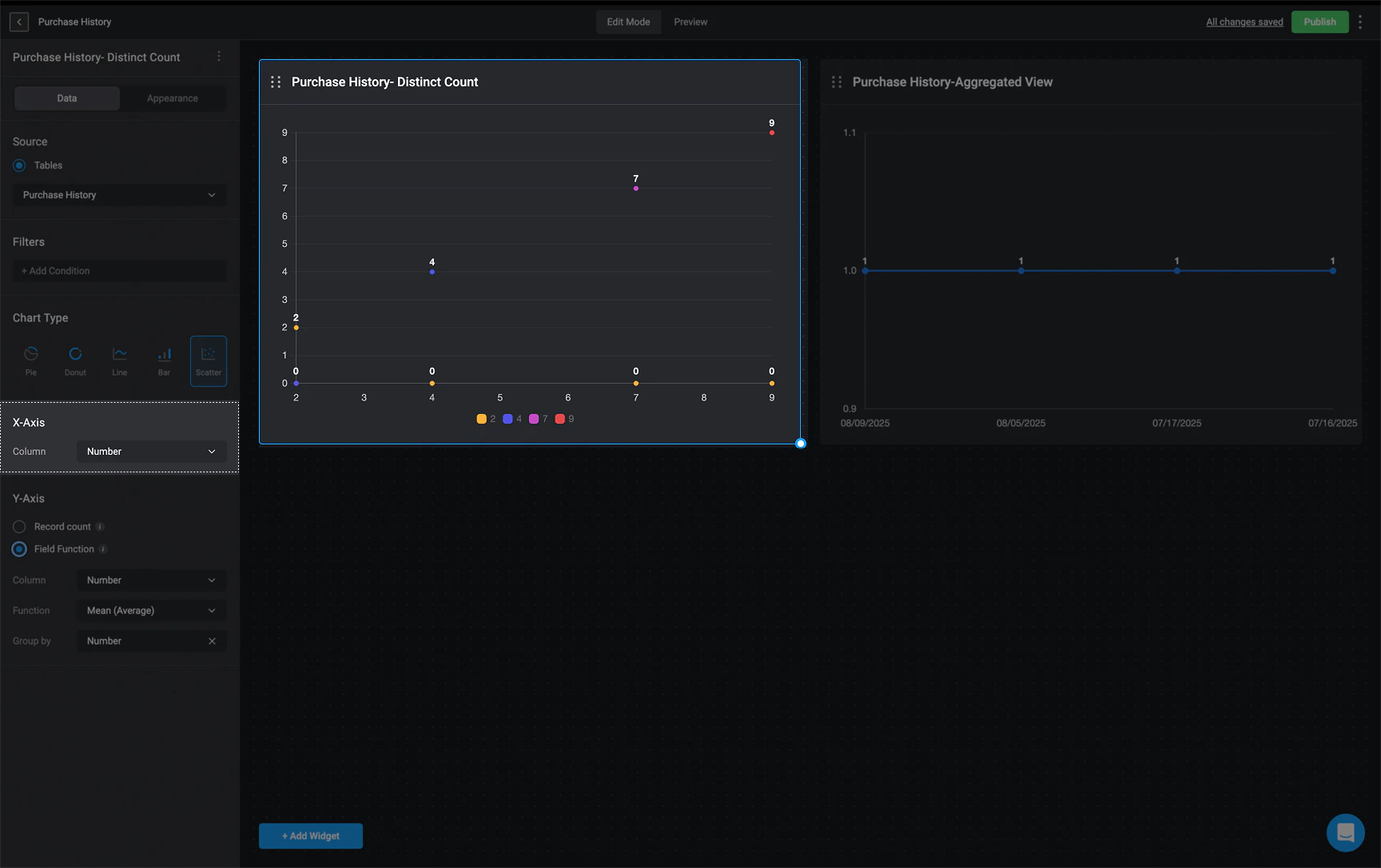 1. If you select **Record Count**:
* The Chart widget will show the total number of records available in the chosen source table.
**OR**
2. If you select **Field Function** (You can only add a **Field Function** if the selected column is a **numeric value**).
* **Choose a column**: `Number`
* **Choose the sum operation that will be used to calculate the selected column values**: `Sum`, `Maximum`, `Minimum`, `Average` or `Median`.
1. If you select **Record Count**:
* The Chart widget will show the total number of records available in the chosen source table.
**OR**
2. If you select **Field Function** (You can only add a **Field Function** if the selected column is a **numeric value**).
* **Choose a column**: `Number`
* **Choose the sum operation that will be used to calculate the selected column values**: `Sum`, `Maximum`, `Minimum`, `Average` or `Median`.
 ## Customize Widget Appearance
In the 'Appearance Tab', you can customize the appearance of a [chart widget](/docs/blink-platform/dashboards/building-a-dashboard/widgets/charts) by selecting a color palette and customizing the legend, as well as the X and Y axis labels.
Widgets that display case severity data will use the **default system color palette** by default. However, you can customize the color palette to better suit your preferences.
## Customize Widget Appearance
In the 'Appearance Tab', you can customize the appearance of a [chart widget](/docs/blink-platform/dashboards/building-a-dashboard/widgets/charts) by selecting a color palette and customizing the legend, as well as the X and Y axis labels.
Widgets that display case severity data will use the **default system color palette** by default. However, you can customize the color palette to better suit your preferences.
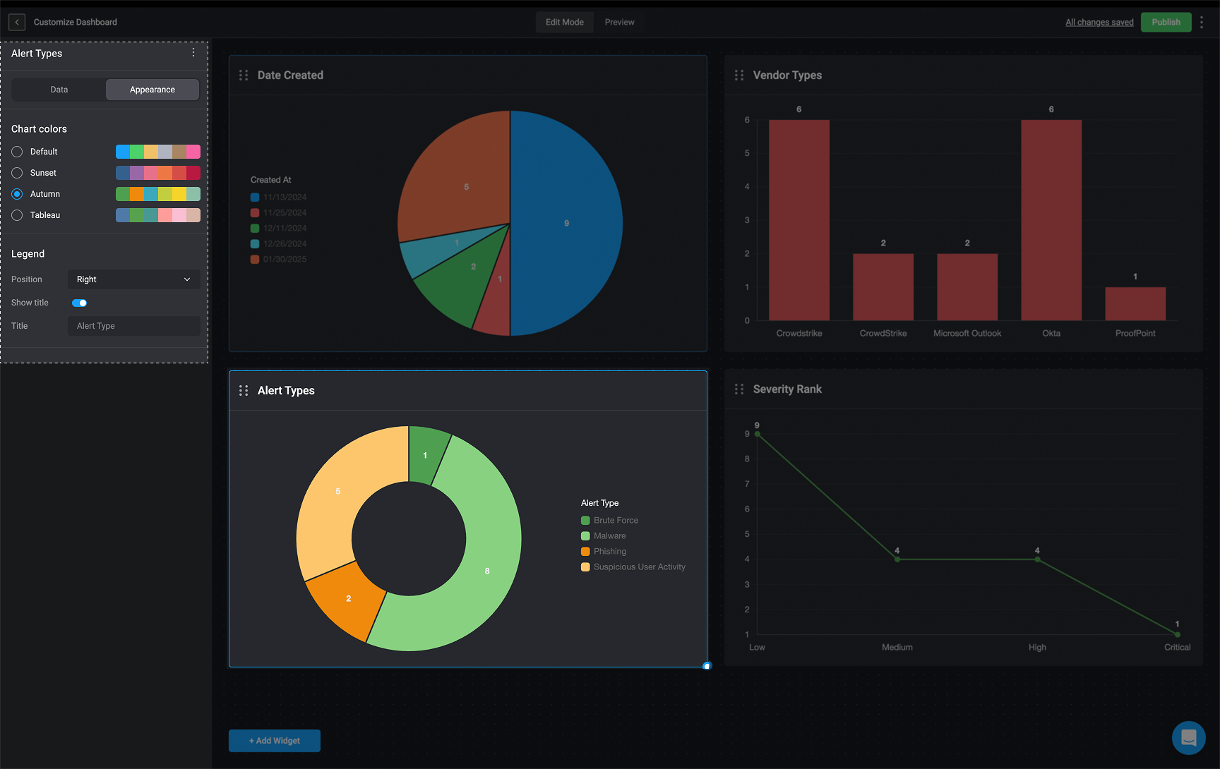
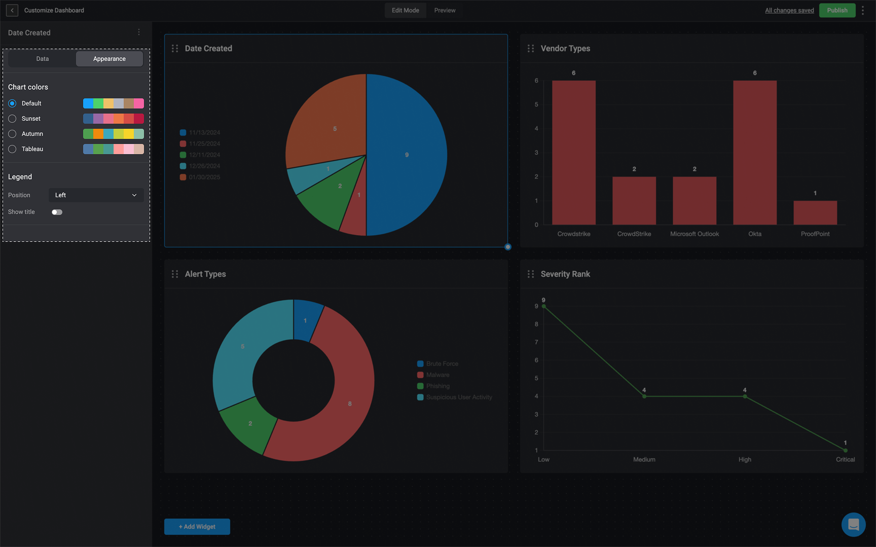 1. **For the [pie chart](/docs/blink-platform/dashboards/building-a-dashboard/widgets/charts#chart-types-and-configuration) and [donut chart](/docs/blink-platform/dashboards/building-a-dashboard/widgets/charts#chart-types-and-configuration) widgets:**
* You can position the legend at the top, bottom, left, or right of the chart, or hide it entirely if you don't want it to be displayed.
* You can also enable a toggle option to display a custom title.
**For Example**
1. **For the [pie chart](/docs/blink-platform/dashboards/building-a-dashboard/widgets/charts#chart-types-and-configuration) and [donut chart](/docs/blink-platform/dashboards/building-a-dashboard/widgets/charts#chart-types-and-configuration) widgets:**
* You can position the legend at the top, bottom, left, or right of the chart, or hide it entirely if you don't want it to be displayed.
* You can also enable a toggle option to display a custom title.
**For Example**
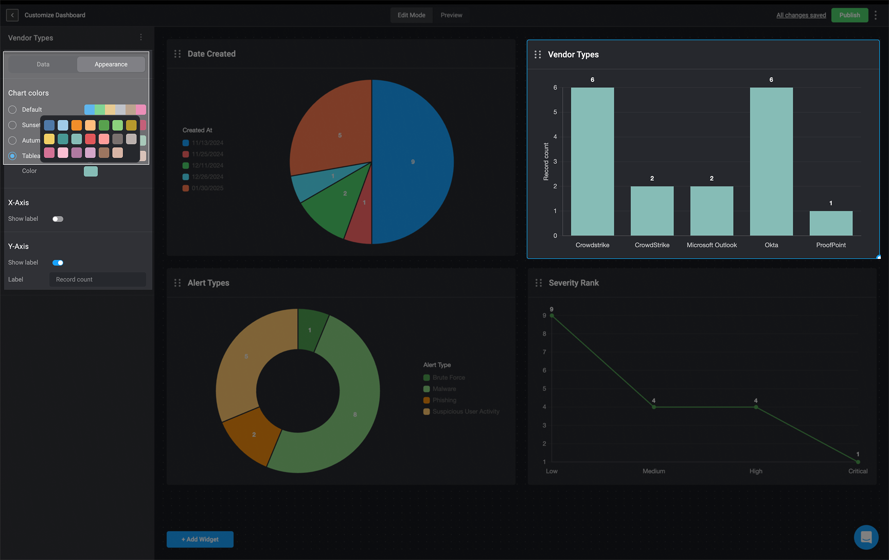
 2. **For the [bar chart](/docs/blink-platform/dashboards/building-a-dashboard/widgets/charts#chart-types-and-configuration), [line chart](/docs/blink-platform/dashboards/building-a-dashboard/widgets/charts#chart-types-and-configuration), and [scatter chart](/docs/blink-platform/dashboards/building-a-dashboard/widgets/charts#chart-types-and-configuration) widgets:**
* To customize the selected chart, choose a single color from the palette by clicking the colored square next to the "Color" label. Then choose a single color to apply to the chart.
* You can toggle options to display labels for the X and Y axes.
**For Example**
2. **For the [bar chart](/docs/blink-platform/dashboards/building-a-dashboard/widgets/charts#chart-types-and-configuration), [line chart](/docs/blink-platform/dashboards/building-a-dashboard/widgets/charts#chart-types-and-configuration), and [scatter chart](/docs/blink-platform/dashboards/building-a-dashboard/widgets/charts#chart-types-and-configuration) widgets:**
* To customize the selected chart, choose a single color from the palette by clicking the colored square next to the "Color" label. Then choose a single color to apply to the chart.
* You can toggle options to display labels for the X and Y axes.
**For Example**
 3. Any other changes made in the **Data** tab, will be automatically applied to the widget in real time.
## Deleting a Chart Widget
1.
3. Any other changes made in the **Data** tab, will be automatically applied to the widget in real time.
## Deleting a Chart Widget
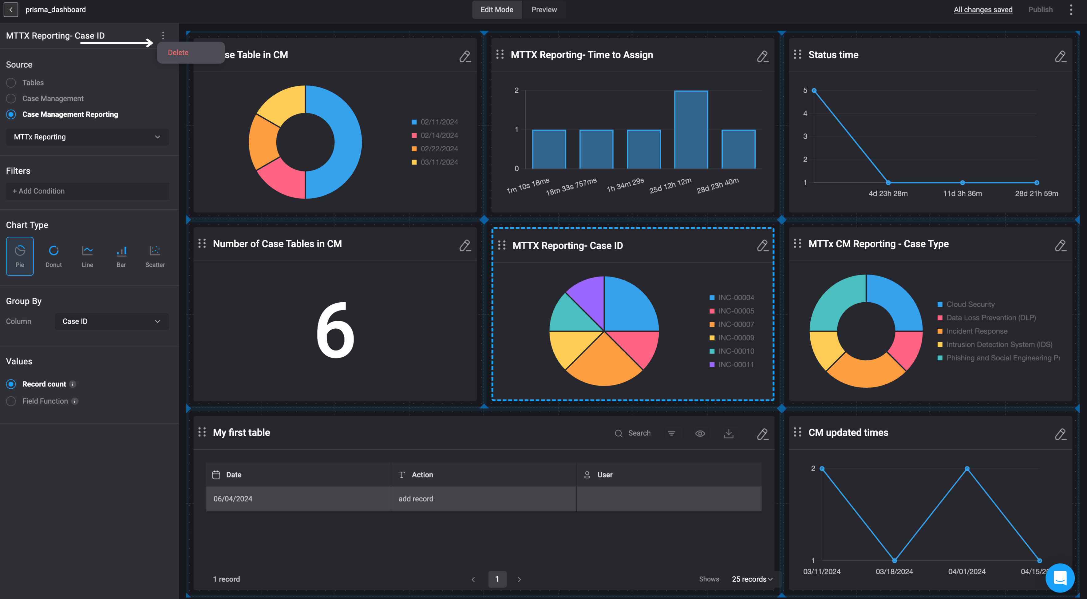
1. In the left-hand sidebar, click the icon in the top-right corner and then select the delete button.
2. The Chart Widget will be removed from your Dashboard Building Interface.